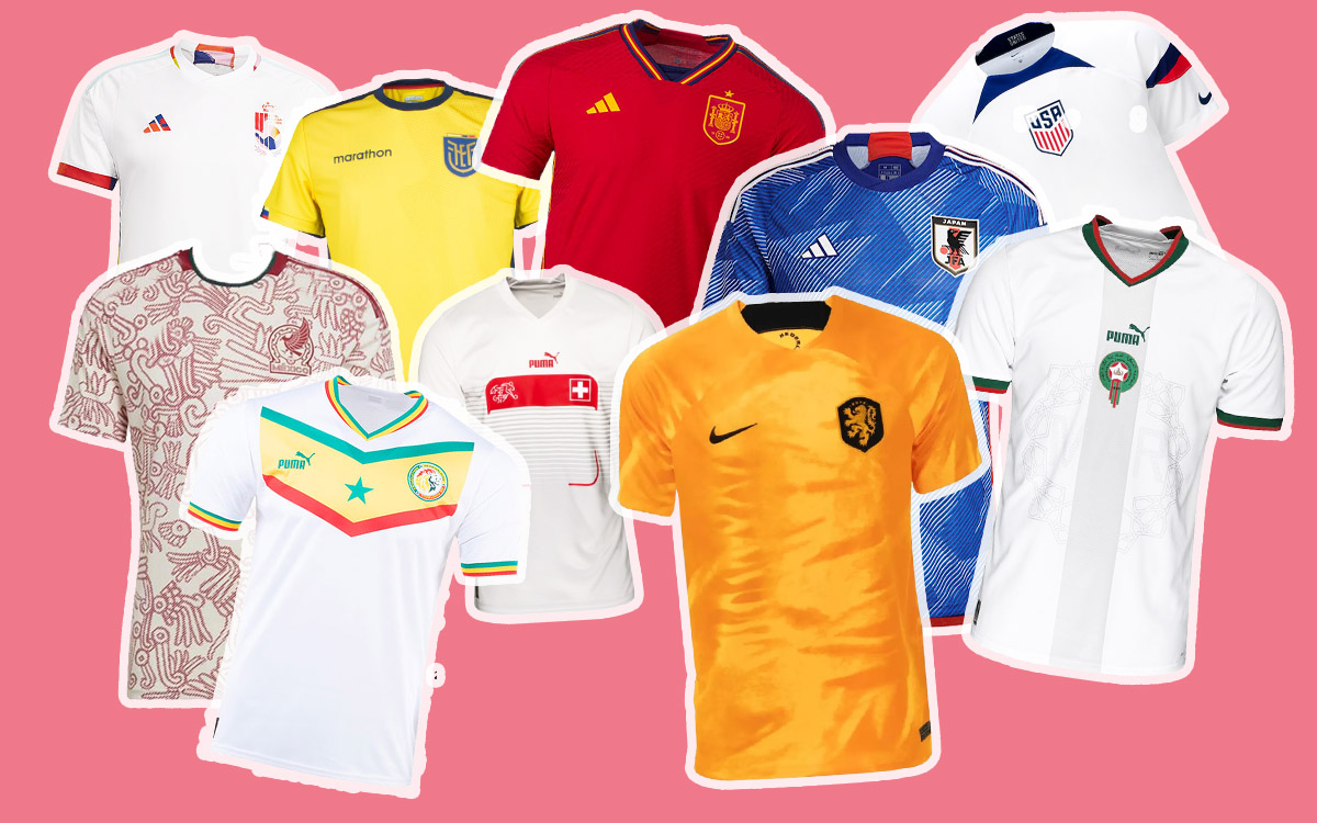
We’re going to let you in on a little secret: Half of the fun of the build up to any World Cup are the reveals of the kits that the competing nations will be wearing. We’re not alone in thinking it either.
The main kit manufacturers are also wise to the excitement that builds in the new drops – as ultimately it will decide whether they will make a boat load of cash or not on their products – and reveal the kits with plenty of pomp and ceremony.
In our position at Esquire as both connoisseurs of football and fashion, gives us a unique perspective and therefore having waited for all the kits to have been unveiled, we can now reveal the input and opinion from our team of experts. You’re welcome…
The Best
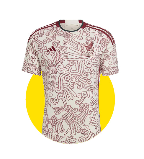
Mexico (Away)
Never before has a World Cup kit looked more like it was made to be worn more often off the pitch than on it, but thanks to the two-tone colourway and prominent Mayan print we think it is simply magnificent.
Senegal (Home)
Puma is always willing to throw caution to the wind when it comes to traditional kit designs, and the manufacturer seems to revel when it comes to African nations in particular. The striking V across the chest is a winner and we’re loving the pops of colour around the neck and sleeve trim.

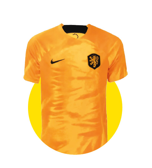
The Netherlands (Home)
Known as ‘Oranje’, the Dutch should be a known quantity when it comes to tournament kits, but when they get it right, they get it very right. Nike has played around with the orange tones using a different one for the top and shorts,
and that top sparkles like pure gold.
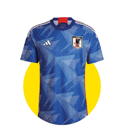
Japan (Home)
Another design that is deeply inspired by the nation’s niche cultures. The scratchy, ununiformed blue lines represent pen-illustrated Manga print, with the shirt pattern paying homage to the Japanese art of origami.
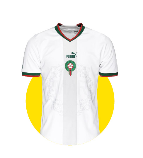
Morocco (Away)
Combining a white base with a light grey central stripe and Morocco’s badge, this kit is both clean and striking. Subtle inclusion of the country’s design motifs, language and ‘Home’ colours add depth and cultural significance to the kit.
The Worst
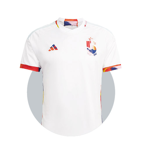
Belgium (Away)
Oh dear. We’re not sure what we dislike most about this kit, the peculiar paint-splatter of colours (none of which represent Belgium’s nickname the ‘Red Devils’) recklessly adoring the edges of the white kit; the light blue Adidas stripes on the shoulders; or the fact they’ve paired it with blue shorts.
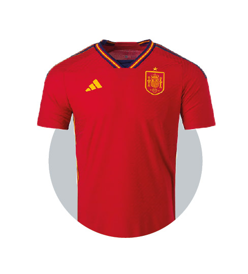
Spain (Home)
Not a lot to see here, folks. Adidas has released what could be one of the most generic of Spanish home kits of all time. Sure, there’s nothing wrong with it, but there’s not much right about it either.
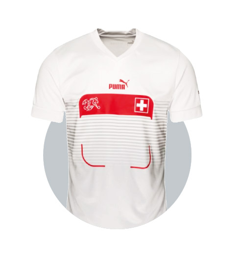
Switzerland (Away)
Okay, we get it, the Swiss aren’t the world’s most exciting people, but surely they deserve better than this kit that looks like the calendar on your phone. Puma has seemingly released an official kit that arguably looks worse than any unofficial fast-fashion versions.
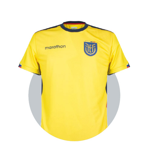
Ecuador (Home)
While most noise around World Cup kits come from the three big manufacturers, we are always intrigued to see what the little guys can bring to the party. Unfortunately for Ecuador, Marathon’s offering for this year’s tournament is a total snorefest. It’s not a sprint,
we guess…
USA (Home)
Thankfully we are long past the days when America ‘didn’t get’ football, but off the back of this kit from Nike, we may have to reconsider that viewpoint. This certainly looks like a sports kit, but we’re not sure it’s a football shirt, oh sorry, jersey.

